Rainbow

Redesigning an e-commerce platform for a family-run, general merchandise shop.

Website
UX/UI Design
E-commerce
Overview
Redesigned Rainbow's e-commerce experience to help a family-run store recover from declining foot traffic and an outdated, hard-to-use website. I scoped and launched a Shopify MVP focused on houseplants, using in-store observation and usability testing to build a culturally rooted, online store.
My Role
Solo UX Designer – Led the project end-to-end, from research and MVP scoping to wireframes and final build in Shopify. Now supporting on-going updates based on post-launch usage.
Team
Storeowners
Timeline & Status
12 Months, Launched — currently in post-MVP updates

In a rush? Read these highlights.

Pain Points
  • 1. Customers didn't know what Rainbow sold online.
  • 2. The previous site was outdated, not scannable, and not mobile-friendly.
  • 3. No clear way to browse or explore products.
Goals
  • 1. Launch with Rainbow's most popular and recognizable product category.
  • 2. Improve navigation across devices with clear, intuitive structure.
  • 3. Build trust through consistent storytelling and visuals.
🔍
Research
Observed store behavior, reviewed Yelp reviews, and tested desktop prototypes with 3 users.
🛠️
Design Process
Scoped MVP to houseplants, designed mid-fidelity wireframes, and built directly in Shopify for speed and responsiveness.
⚖️
Challenges
Worked solo with storeowners as stakeholders, balanced usability with Shopify constraints, and iterated based on informal and formal feedback.
📈
Observed Impact
+180% session growth post-launch; site now supports in-store browsing and product lookups.

Highlights

  • Project goal:
  • Research process:
  • Design process:
  • User testing:
  • Impact:

From storefront to Shopify.

Why build an e-commerce?

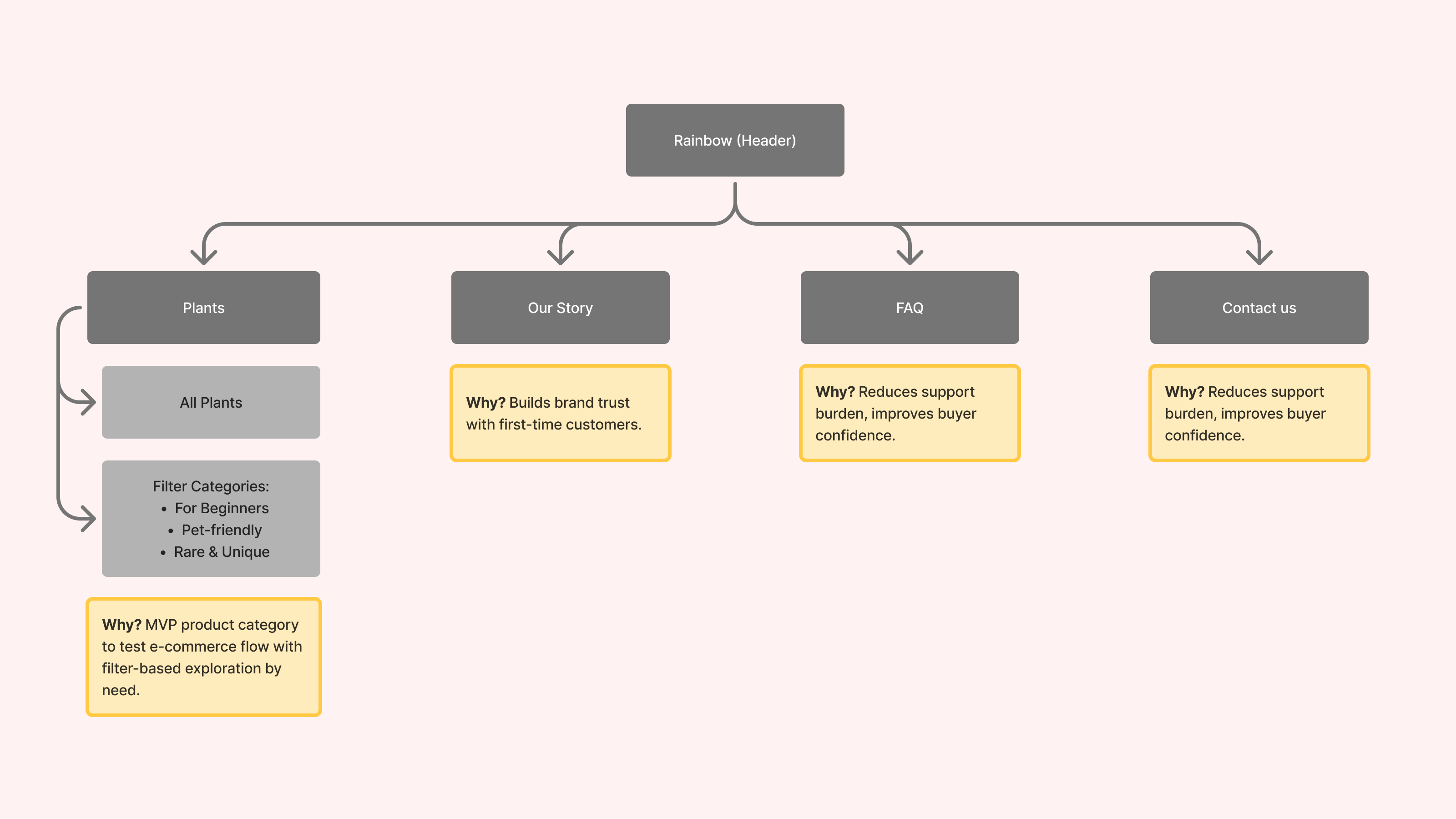
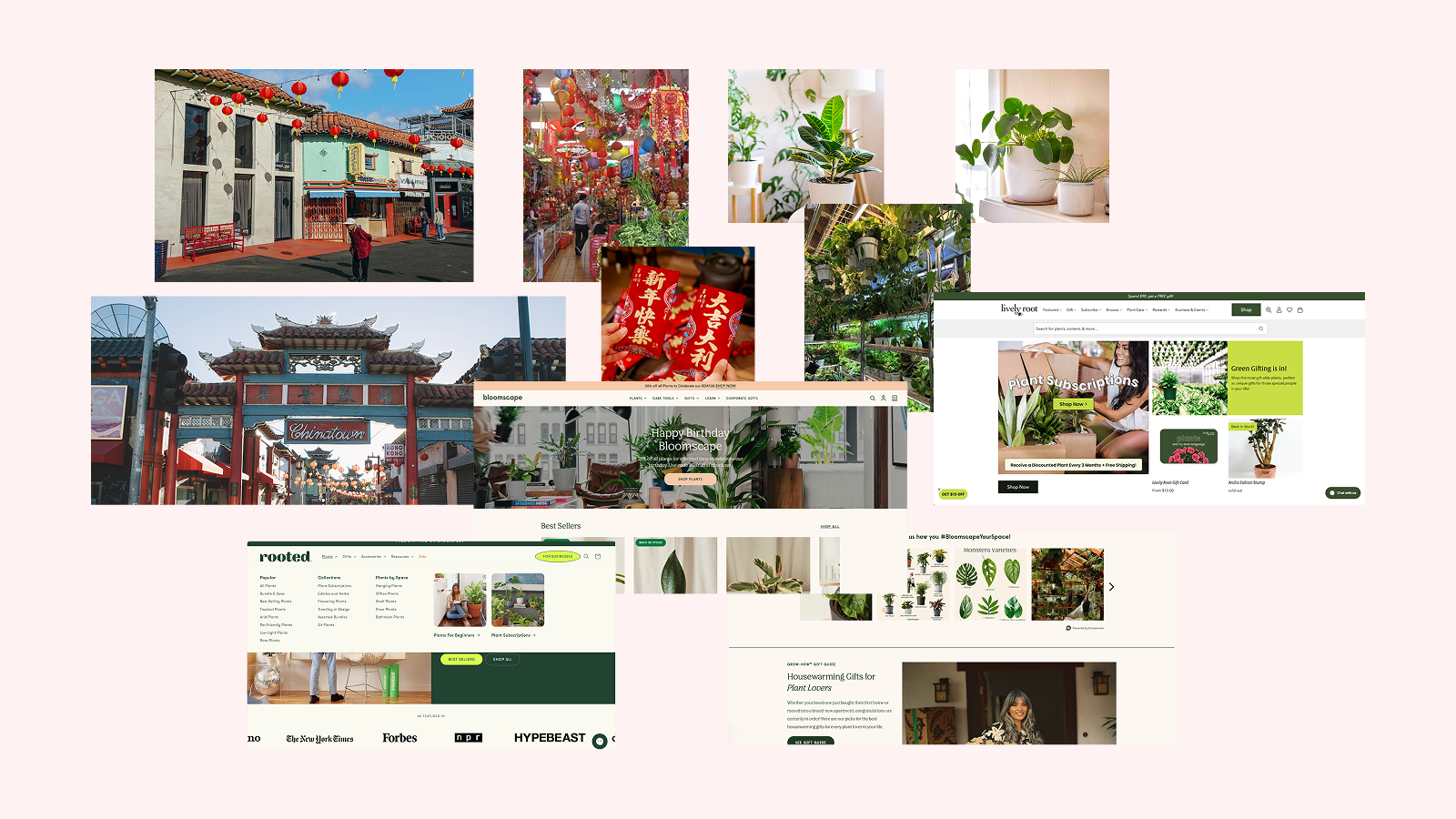
Rainbow is a family-run shop in LA's Chinatown, known for its traditional altars, feng shui goods, and houseplants. As gentrification reduced foot traffic, the store needed a modern e-commerce site that could preserve its cultural identity while expanding its reach.

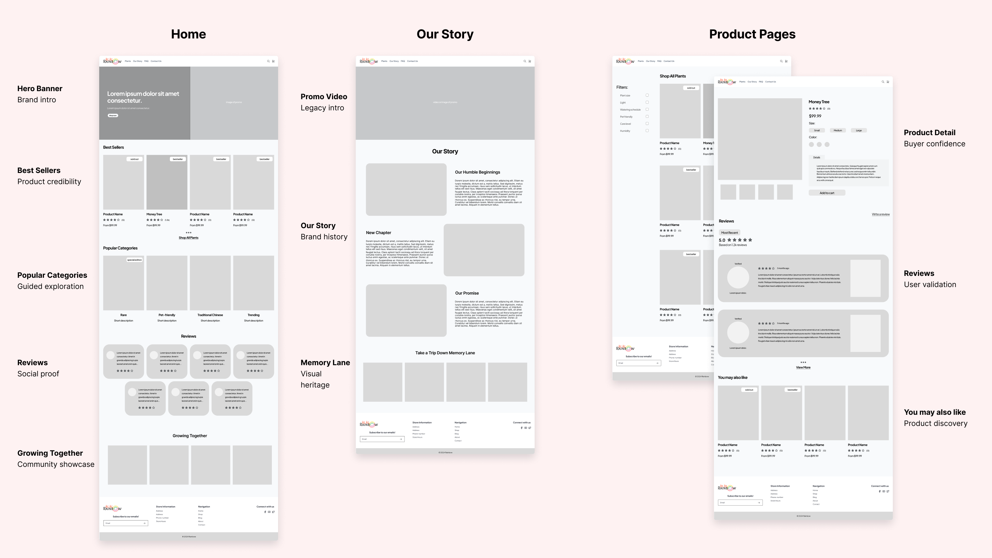
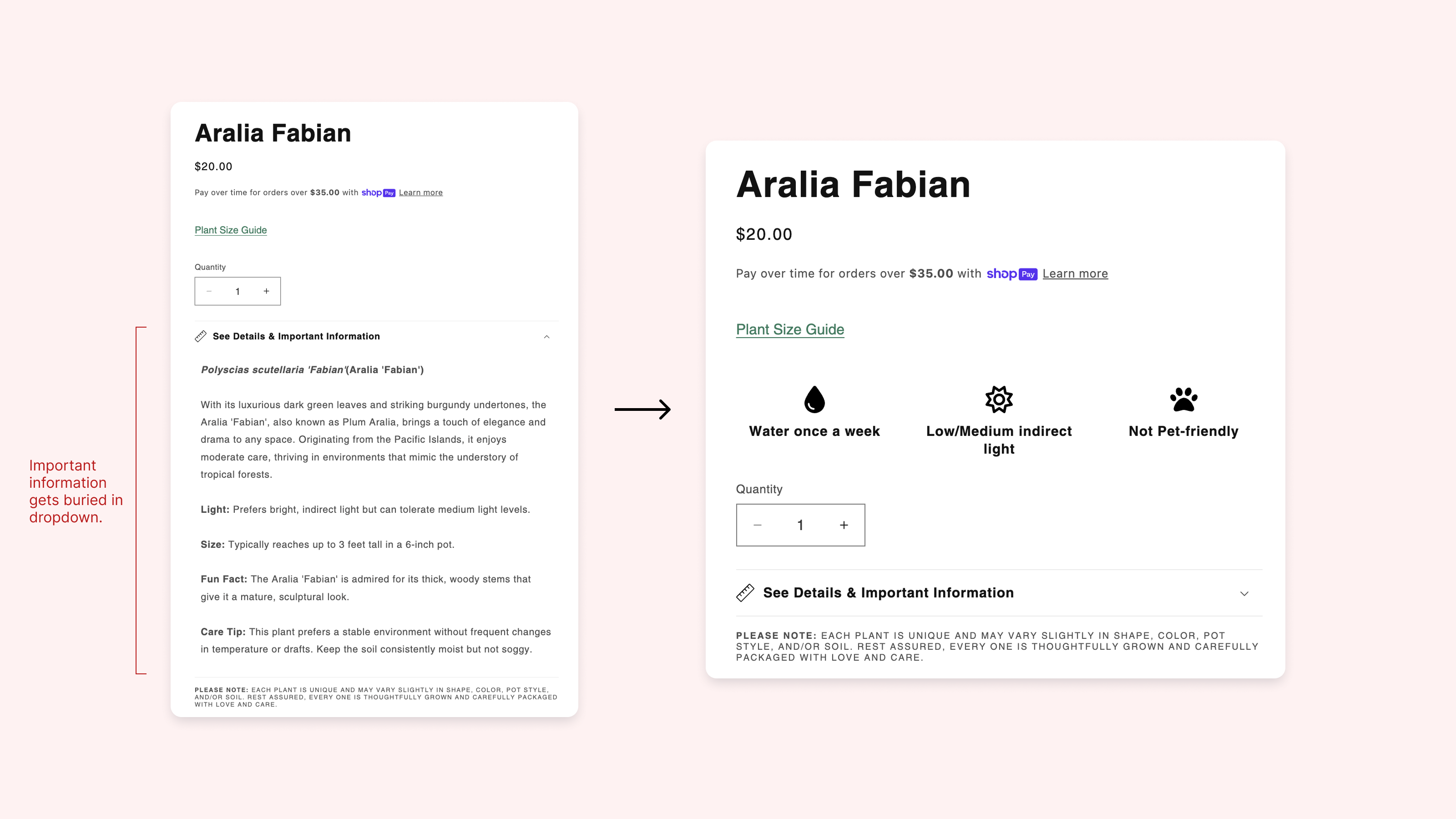
I was brought on to redesign Rainbow's new online storefront, focusing on trust, clarity, and long-term usability for both in-store and digital customers.

Finding focus through fieldwork.

What I observed.

Before the store closed, I visited Rainbow in person to observe how customers interacted with the space and which products drew the most attention.
  • 🔑

    Key Insights:

    1. 1. Younger customers were drawn to houseplants and more likely to shop online.
    2. 2. Older customers preferred in-person experiences and weren't as tech-savvy.
    3. 3. Plants were the first thing customers noticed, often the gateway into exploring other products.

Why start with plants?

With limited time and no fully digitized inventory, I scoped the MVP around a single high-interest cateogry: plants.
  • 🤔

    Supporting Reasons:

    1. 1. Plants were the most frequently mentioned product on Rainbow's Yelp page.
    2. 2. Customers trusted plant quality and often asked for care tips.
    3. 3. Easiest category to photograph, structure, and scale using familiar e-commerce patterns.

What I learned.

  • Pain Points:

    1. 1. Customers weren't sure what Rainbow actually sold online.
    2. 2. The previous site was outdated, not scannable, and not mobile-friendly.
    3. 3. There was no clear way to browse or explore products.
  • Goals:

    1. 1. Launch with Rainbow's most recognizable and trusted category: plants.
    2. 2. Improve navigation and structure across devices.
    3. 3. Build credibility and trust through consistent visuals and storytelling
How might we bring Rainbow's trusted in-store experience online that feels culturally rooted and easy to navigate across devices, starting with plants?

From insights to identity.

Design priorities.

Based on early insights, I focused the design strategy on three key pillars:
  • 👋

    Humanizing the Brand

    To reflect Rainbow's identity as a family-run business, emphasize storytelling and emotional trust through an About section, warm copy, and subtle tone choices.
    ✅ Addresses goal: Build trust through brand clarity.
  • ⭐️

    Building Social Proof

    Incorporate Yelp testimonials and highlighted plant reviews to boost confidence and align with existing customer discovery habits.
    ✅ Addresses pain point: Customers weren't sure what Rainbow sold or if it was reliable
  • 🧧

    Reflecting Community & Culture

    Draw inspiration from Chinatown textures, colors, and visual motifs to create an interface that felt culturally grounded and locally authentic.
    ✅ Addresses goal: Make the site feel community-first and culturally rooted

Early wireframes.

I explored layouts focused on clarity, intuitive structure, and minimal friction. Early wireframes prioritized scannability, simple navigation, and a familiar layout that could support scaling.

Designing with feedback.

Usability Testing.

I tested the desktop site with 3 users to evaluate browsing, product exploration, and checkout. The structure of the website worked well overall, but one key issue emerged:
  • 💬

    "I wish I could quickly see if the plant was pet-friendly or how much light it needs."

    🛠️ In response: Use icons and short labels for quick scanning.

Photography for trust & visual clarity.

While not prompted by testers, I proactively shot product photos to ensure consistency, reduce ambiguity, and elevate brand trust. Photography played a key role in helping users understand product quality, especially without a physical store.

Introducing Rainbow.

A new and improved website for customers.

After translating mid-fidelity into a live Shopify build, the final storefront reflects Rainbow's in-person charm while making it easy to browse and shop across devices, starting with plants as our MVP.

Measuring what matters.

Observed impact (Feb-May 2025).

Following the store's soft reopening at a new location in early 2025, the redesigned website became a helpful in-store companion for browsing and product lookup:
  • 📈

    +180% Increase in Sessions

    Over 1,700 visits in 90 days, primarily from customers viewing products before or during in-person shopping.
  • 🪴

    Improved Product Discoverability for Plants

    Photography, icon-based care info, and category filters made it easier for customers to explore and evaluate options.
  • 📱

    Responsiveness Access Across Devices

    Shopify's mobile-ready design allowed users to comfortably browse on both desktop and mobile.

How will we measure success?

To ensure that the product is working, these are the ways that we would measure success:
  • 📊

    Next-phase Metrics

    • 1. Increase in filter usage and product page interactions.
    • 2. Qualitative feedback on browsing ease and layout clarity.
    • 3. Growth in add-to-cart and order completions post-catalog update.

Looking back, moving forward.

Conclusion.

As the solo designer on this project, here are key takeaways and what I'd revisit with more time or user input:
  • 📈

    Key Lessons:

    • 1. Clarity in layout made the experience more usable for everyday shoppers.
    • 2. Strong photography and brand tone increased buyer confidence.
    • 3. Building directly in Shopify helped me stay resourceful and move fast without sacrificing UX.

Currently updating (as of June 2025).

While site traffic grew by 180% post-launch, no online orders have been placed. I'm now updating the catalog and filters, and analyzing potential friction points in product clarity, category structure, and purchase flow.