Designed an end-to-end flow for real estate underwriters to help replace Excel-heavy workflows with faster deal analysis.
Start Up
Fintech
Web App
UI/UX
Overview
Designed Anhil's MVP experience to help commercial underwriters move from spreadsheets to clear, exportable reports, focusing on property input, data analysis, and lean onboarding. I defined and prioritized core user flows to unlock value quickly, aligned business and tech needs, and laid the foundation for future automation and reporting scale.
My Role
Solo Product Designer – Led all core flows from scratch, working directly with the founder and supporting dev handoff through detailed specs and walkthroughs.
Team
Founder 6–7 Backend Engineers (Remote)
Timeline & Status
4 Months, Currently in development
In a rush? Read these highlights.
❌
Pain Points
1. Manual data entry slowed analysis and led to mistakes.
2. Users feared sharing the wrong report via email.
3. Users struggled to manage complex financial data over time.
✅
Goals
1. Streamline data input to reduce errors and save time.
2. Centralize reporting to reduce errors and simplify sharing.
3. Establish scalable systems that support long-term data modeling.
🔍
Research
Analyzed our competitors, ARGUS, Rockport Val, and Excel to define core user flow for our MVP.
🛠️
Design Process
Prioritized supporting flows first to unblock backend dev, then designed core MVP flows and wireframes.
⚖️
Challenges
Worked without user access, made fast tradeoffs with founder input, and balanced clarity with backend feasibility.
📈
Predicted Impact
~60% faster onboarding, improved trust in reports, and scalable UX patterns for AI and future roles.
Highlights
Project goal:
Research process:
Design process:
User testing:
Impact:
Context
From spreadsheets to strategy.
Why Anhil?
Commercial real estate underwriters often juggle Excel, PDFs, and email to analyze deals and report findings. To clarify where our MVP could make the most impact, I partnered with the founder to identify key pain points and product goals:
❌
Pain Points:
1. Users copied data across PDFs, spreadsheets, and emails, making the process error-prone and slow to analyze.
2. Manually downloading and emailing reports often led to version mix-ups, delays, and collaboration mistakes.
3. Without structure, new users felt overwhelmed organizing key deal inputs, especially as data grew more complex.
✅
Goals:
1. Streamline data input to reduce copy-paste work and help users complete onboarding faster.
2. Centralize reporting and sharing into one platform to avoid email mistakes and improve team colaboration.
3. Establish scalable systems that support growing portfolios and prepare users for future automation needs.
the Challenge
How might we simplify the process of underwriting so that users can spend less time wrangling data and more time making decisions?
Research
Designing with constraints.
Analyzing our competitors.
To understand how underwriters evaluate real estate deals, I analyzed three core tools in the space, ARGUS, Rockport VAL, and Excel. This helped clarify the strengths and limitations of existing workflows and where Anhil could offer a better balance of clarity, customization, and speed.
Creating the user flow.
With these key insights, I created a simplified flow that prioritized quick onboarding, flexible reporting, and data clarity while still reflecting the depth that underwriters expect.
Ideation
Building the product step-by-step.
Prioritizing what to design first.
To align on what mattered most, I worked with the founder and engineers to prioritize features that directly solved user pain points, like property creation and report exports, since these were essential to replacing manual workflows. Supporting flows such as login and subscriptions were tackled first to enable backend development and ensure user data could be stored and accessed properly.
Laying the foundation in wireframes.
I referenced our competitors to ground the interface in familiar mental models for financial users. These wireframes prioritized clarity and control such as editable tables, grouped sections, and a layout optimized for scanning key metrics. They allowed us to move quickly in dev handoff and ensured the product felt intuitive to users accustomed to spreadsheet-based workflows.
Feedback & Iteration
Designing with feedback.
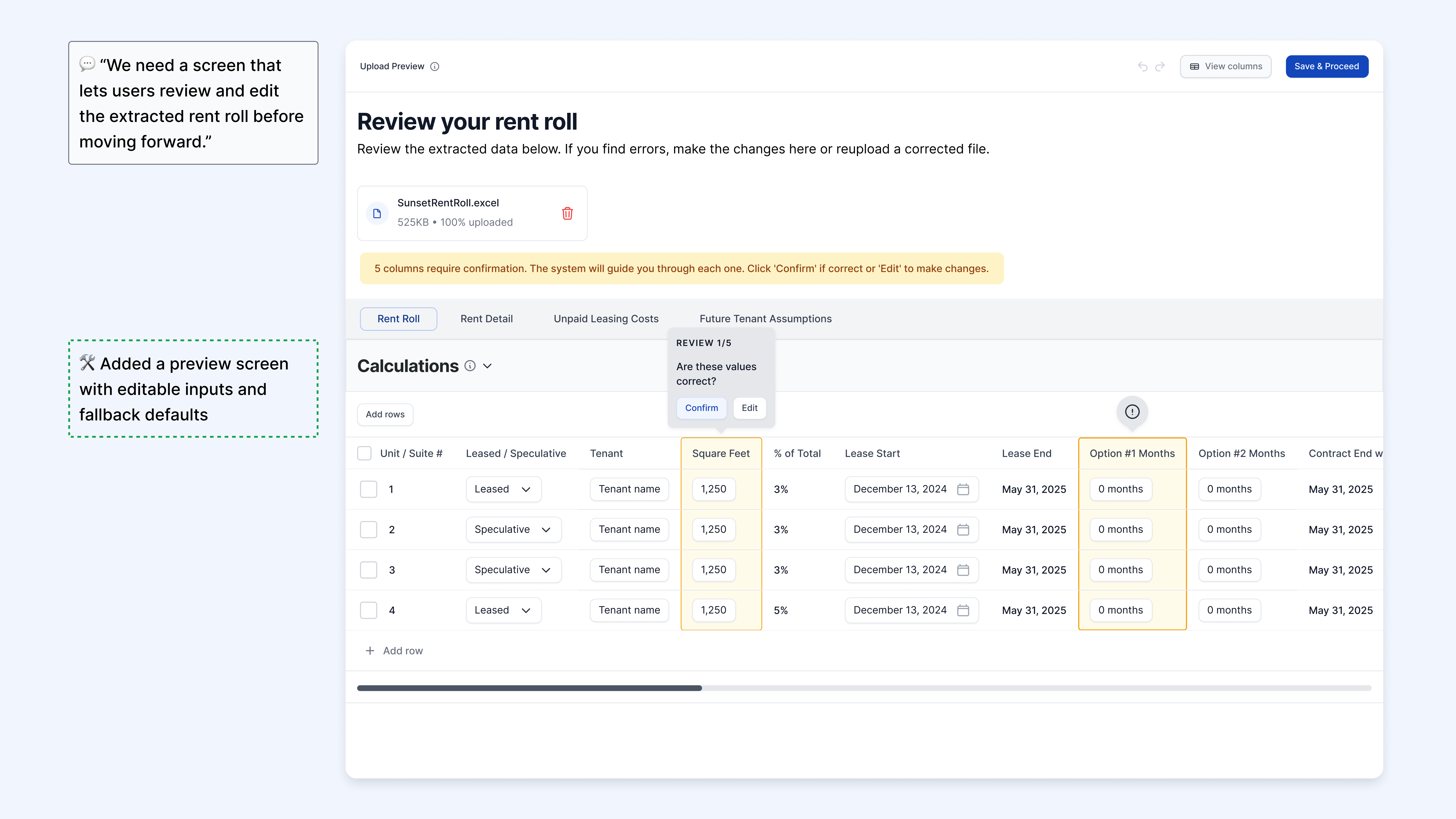
Clarifying OCR accuracy with a preview step.
To address onboarding friction and reduce data entry errors, I added a rent roll preview screen before sending users into the dashboard. This included editable fields and fallback defaults, allowing users to verify and correct extracted data. The update improved accuracy, built trust in the system, and made onboarding faster and less error-prone.
Prioritizing flexibility in a complex table view.
To simplify reporting and support flexible data views, I designed a customizable filtering system for dense outputs like the cash flow tables. Instead of a static collapse feature, users could toggle specific sections based on their needs. This reduced cognitive load, gave users more control, and laid the groundwork for scalable reporting.
Final designs
Introducing Anhil.
A new way to underwrite.
These final screens reflect the core user journey across Anhil's MVP, from onboarding and property input to analyzing data and sharing reports. Each interface was designed to reduce friction, surface key insights, and adapt to the workflows of financial professionals used to spreadsheet-based tools.
Impact
Measuring what matters.
Predicted outcomes.
Once launched, Anhil is expected to improve key workflows by:
🏃
~60% Faster Property Onboarding
A guided step-by-step flow and rent roll preview reduce friction and speed up initial deal setup, from ~45-60 minutes to under 20.
📑
Cleaner Reporting & Collaboration
Centralized exports and shareable views help users move away from PDFs and email, supporting faster reviews and external handoffs.
🧠
Increased User Confidence
Editable inputs, validation defaults, and filtering tools make large datasets easier to control, even for power users.
How will we measure success?
To measure success, these are the ways that we would do it:
📈
Quantitative Metrics
1. % of users who complete property onboarding
2. Number of report exports, views, shares
3. Time spent in Data Explorer per session
💬
Qualitative Feedback
1. Usability feedback on clarity, control, and setup speed
2. Survey responses on onboarding satisfaction and ease of use
Reflection
Looking back, moving forward.
Conclusion.
As the solo designer on this project, here are key takeaways and what I'd revisit with more time or user input:
📈
Key Lessons:
1. Prioritizing the most critical user flows to deliver value fast.
2. Creating systems that scale across complex dashboards and spreadsheets.
3. Advocating for users when short-term decisions risked long-term clarity.
💬
If I had more time and user access, I would have:
1. Conducted early usability tests to validate onboarding and reporting flows.
2. Defined success metrics tied to user activation and retention.
View more Work
AI
Start Up
Web App
UI/UX
Pactto: AI video conference & collaboration platform
Designed async collaboration features for an intelligent video review platform.
Start Up
Fintech
Web App
UI/UX
Anhil: Commercial real estate underwriting platform
Designed an end-to-end flow for real estate underwriters to help replace Excel-heavy workflows with faster deal analysis.
E-commerce
Website
UI/UX
Rainbow: E-commerce platform for a family-run store
Redesigned a family-run store's outdated site into a plant-focused e-commerce experience.
Nonprofit
Web App
Mentorship Platform
UI/UX
BobaTalks: Mentorship platform for college students
Designed a scheduling app to make mentorship more accessible for college students.


%2016_9.png)